Get the book!
The Inclusive Components book is now available, with updated and improved content and demos.

When you think about it, most of your basic interactions are showing or hiding something somehow. I've already covered popup menu buttons and the simpler and less assuming tooltips and toggletips. You can add simple disclosure widgets, compound "accordions", and their sister component the tabbed interface to that list. It's also worth noting that routed single-page applications emulate the showing and hiding of entire web pages using JavaScript.
As we shall explore, the conceptual boundaries between tab panels, application views, and simple document fragments are not as clearly defined as we might like to pretend. Nonetheless, we need to assert with confidence precisely what kind of interface we are providing the user, otherwise they won't find the confidence to successfully operate it.
Proponents of progressive enhancement conceive interfaces in terms of structured static content before contemplating how those interfaces may become enhanced with additional JavaScript-enabled interactivity. Even if you are happy to concede a JavaScript dependency early in an interface's design, it's beneficial to build a robust foundation using semantic HTML, capitalizing on standard browser behaviors. Sometimes you may even find JavaScript enhancement is a step you needn't take.
For my money, an embryonic tabbed interface is just a table of content with same-page links pointing at different sections of the page. Both a table of content and a list of tabs allow the user to choose between distinct sections of content.
- Table of contents → tab list
- Same-page links → tabs
- Sections → tab panels

CSS enhancement
What if I used some CSS to make just the chosen section from my table of contents visible? This is certainly possible using the :target pseudo-class.
section:not(:target) {
  display: none;
}
By placing the disclosure of content under the user's control, our CSS-enhanced TOC interface moves towards being a tabbed interface in one critical regard. Since display: none hides content from assistive technologies, this enhancement affects screen reader users as much as anyone else.
Take the TOC links and align them horizontally, then this little CSS experiment begins to really look like a tabbed interface. But herein lies a problem.
In Chapter 2 of his book, Resilient Web Design Jeremy Keith talks about material honesty; that "one material should not be used as a substitute for another." In this case, we'd be making a table of contents appear like a tab list. We should avoid this since users who see tabs expect certain behaviors not offered by a simple list of links.
It is for the same reason that a tabbed design should not be employed for site-wide navigation. At the very least, when a user selects a "tab" they would not expect to be navigated to an entirely new page!
I have encountered innumerable JavaScript-driven and ARIA-adorned, fully-fledged tabbed interfaces where simple tables of content atop page sections would have done just as well. Better even, since they are more robust and efficient. But for goodness' sake make them look like tables of content. Meet the expectations you set in visual design with your semantics and behaviors.
True tabbed interfaces
The advantage of using lists of same-page links and the standard browser behaviors they invoke is that they are simple and easy to understand — especially since the behavior of links is peculiar to the web.
Tabbed interfaces, on the other hand, are a paradigm imported from desktop applications. If they are understood by users in the context of web pages at all it is only through very careful and deliberate exposition of visual design and ARIA semantics.
What makes a tabbed interface a tabbed interface is in the ergonomics of its keyboard behavior. Really the only reason the ARIA semantics need be present is to alert screen reader users to the keyboard behaviors they should expect. Here is the basic semantic structure with notes to follow:
<ul role="tablist">
  <li role="presentation">
    <a role="tab" href="#section1" id="tab1" aria-selected="true">Section 1</a>
  </li>
  <li role="presentation">
    <a role="tab" href="#section2" id="tab2">Section 2</a>
  </li>
  <li role="presentation">
     <a role="tab" href="#section3" id="tab3">Section 3</a>
  </li>
</ul>
<section role="tabpanel" id="section1" aria-labelledby="tab1">
  ...
</section>
<section role="tabpanel" id="section2" aria-labelledby="tab2" hidden>
  ...
</section>
<section role="tabpanel" id="section3" aria-labelledby="tab3" hidden>
  ...
</section>
- This tabbed interface is progressively enhanced from a table of content and corresponding document sections. In some cases this means adding (
aria-selected) or overriding (role="tab") semantics. In others (role="presentation") it means removing semantics that are no longer applicable or helpful. You don't want a set of tabs to also be announced as a plain list. role="tablist"does not delegate semantics to its children automatically. It must be used in conjunction with individualtabroles in order for tabs to be identified and enumerated in assistive technologies.- The
tabpanelelements which do not correspond to the selected tab are hidden using thehiddenattribute/property. - Users who enter a tabpanel should be assured of its identity. Hence,
aria-labelledbyis used to label the panel via the tab name. In practice, this means a screen reader user entering a panel and focusing a link will hear something like "Section 1 tab panel, [link label] link".
Keyboard behavior
Unlike a same-page link, a tab does not move the user to the associated section/panel of content. It just reveals the content visually. This is advantageous to sighted users (including sighted screen reader users) who wish to flit between different sections without having to wade back up the page each time they want to choose a new one.
This comes with an unfortunate side effect: If the user wishes to move to a section by keyboard and interact with its internal content, they have to step through any tabs to the right of the current tab, which are in focus order.

This problem is solved by delegating tab selection to arrow keys. The user is able to select and activate tabs using the arrow keys, while the Tab key is preserved for focusing contents within and below the active tab panel. To put it another way: Tab is not for tabs, which I concede is a bit confusing. I wish the key and the control had different names, but alas.

It's equally important that pressing Shift + Tab returns the user to the selected tab. This is all possible by giving each tab but the selected tab tabindex="-1", which removes the inactive tabs from focus order but allows focus via a script. In the following example, the second tab is the selected tab, as denoted by the aria-selected state being set to true.
<ul role="tablist">
  <li role="presentation">
    <a role="tab" tabindex="-1" href="#section1">Section 1</a>
  </li>
  <li role="presentation">
    <a role="tab" href="#section2" aria-selected="true">Section 2</a>
  </li>
  <li role="presentation">
     <a role="tab" tabindex="-1" href="#section2">Section 3</a>
  </li>
</ul>
With tabindex="-1" in place for the remaining tabs, I can capture the keydown event for the left or right arrow keys to make the desired inactive tab active.
tab.addEventListener('keydown', e => {
  let dir = e.which === 37 ? 'left' : 39 ? 'right' : null;
  if (dir) {
    switchTab(e.eventTarget, dir);
  }
})
Each time a user selects a new tab, the corresponding tab panel is revealed. When the second of four tabs is selected, any screen reader running will say something similar to "[tab label], selected, tab, 2 of 4". Plentiful information.
A problem reading panels
Now that pressing Tab bypasses the tabs, it's trivial for keyboard users to move focus to the first of any links or other interactive elements in the open panel.
The experience for screen reader users is not currently as optimal. Although they too can focus elements inside the panel directly from the selected tab, blind users cannot see any content that comes before or after that interactivity. If there is no interactive content in the panel at all, they will unwittingly focus the first interactive element outside and below the tab interface.
In the operation of screen readers like NVDA and JAWS, the down arrow moves the user to the next element (focusable or otherwise) and reads it out. Without intervention, this would be the next tab in the tablist. Instead, we can intercept the down arrow key press and move focus programmatically to the open panel itself, making sure it isn't missed. See panels[i].focus() in the following snippet:
tab.addEventListener('keydown', e => {
  let index = Array.prototype.indexOf.call(tabs, e.currentTarget);
  let dir = e.which === 37 ? index - 1 : e.which === 39 ? index + 1 : e.which === 40 ? 'down' : null;
  if (dir !== null) {
    e.preventDefault();
    dir === 'down' ? panels[i].focus() : tabs[dir] ? switchTab(e.currentTarget, tabs[dir]) : void 0;
  }
});
The void 0 part means "do nothing" for the case that the adjacent tab does not exist (because you're already at the start or end of the tablist). You can see the full script in the CodePen demo.
Since tab panels are labeled by their tabs, when the down arrow is pressed and the relevant tab panel focused, a screen reader will announce, "[tab label], tab panel", thereby assuring the user of their new location within the interface. From there, they can continue to browse down through the tab panel's descendant elements or press Shift + Tab to return to the tablist and the selected tab.
Although sighted keyboard users are less likely to use the down arrow key, it's important the focused tab panel has a focus style to indicate a change of focus location. This focusable panel provision does not impede operation for sighted keyboard users, who can do everything they need with just the Tab and left and right arrow keys.
The focus of non-interactive elements
In this implementation we are technically making a non-interactive element focusable by the user, albeit via an atypical key.
The general rule is not to allow the focus of non-interactive elements by the user because the expectation is that focusable elements will each actually do something. Accordingly, code like the following would fail WCAG's 2.4.3 Focus Order success criterion. It offers an unusable element to be used.
<h2 tabindex="0">Section 3<h2>However, directing focus to an element using a script is acceptable where the user has chosen that change of context. In some single-page application implementations, when a user chooses a new "view", the newly constructed view element or its main heading is focused.
<h2 tabindex="-1">Application View<h2>Focusing the heading will announce the heading content,
which doubles as the view's label. This lets screen reader users know about their change of context. Note the use of tabindex="-1". As with our arrow key-controlled tabs, this allows focus by script but not directly by the user (unless a custom key is assigned). In practice, it lets us move focus without adding the focused element to the user's tab order — as tabindex="0" would.
Here is a codePen of the tab interface, written in native JavaScript and with the behaviors and semantics discussed. It is progressively enhanced from a list of links and <section> elements and is 1.3KB minified as ES5:
Responsive design
Responsive design is inclusive design. Not only is a responsive design compatible with a maximal number of devices, but it's also sensitive to a user's zoom settings. Full-page zoom triggers @media breakpoints just as narrowing the viewport does.
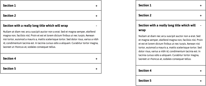
A tabbed interface needs a breakpoint where there is insufficient room to lay out all the tabs horizontally. The quickest way to deal with this is to reconfigure the content into a single column.

This can no longer be considered a "tabbed interface" visually because the tabs no longer look like tabs. This is not necessarily a problem so long as the selected tab (well, "option") is clearly marked. Non-visually, via screen readers, it presents and behaves the same.
Accordions for small viewports?
Some have made noble attempts to reconfigure tabbed interfaces into accordion interfaces for small viewports. Given that accordions are structured, attributed, and operated completely differently to tabs, I would recommend against this.
Accordions do have the advantage of pairing each heading/button with its content in the source, which is arguably a better browsing experience in a one-column configuration. But the sheer complexity of a responsive tabbed interface/accordion hybrid is just not worth it in performance terms.
Where there are very many tabs or the number of tabs are an unknown quantity, an accordion at all screen widths is a safe bet. Single-column layouts are responsive regardless of content quantity. Easy squeezy.
When panels are views
You'll recall my note from earlier that making the set of links in site navigation appear like a set of tabs is deceptive: A user should expect the keyboard behaviors of a tabbed interface, as well as focus remaining on a tab in the current page. A link pointing to a different page will load that page and move focus to its document (body) element.
What about the "views" in single-page applications: the different screens found at different routes? Technically, they are closer to the panels of our tab interface than whole web pages. But that's not to say they should be communicated as tab panels, because that's not what a user is likely to expect.
Single-page application views are typically intended to seem like distinct web pages or regions in a web page, so that is the story that should be told. Here are some provisions to make:
Use links!
Make sure the links that allow users to choose between views are indeed links — whether or not those links return false and use JavaScript to switch to the new view. Since these controls will navigate the user (by changing their focus location; see below) the link role is the most appropriate for the behavior. Link elements do not need the link ARIA role attribute; they are communicated as "link" by default.
In Xiao, a progressive enhancement-based router system for single-page applications, standard hash fragments are used to denote views. The links to these fragments will be communicated as "same page links" in most assistive software. By capitalizing on standard browser behavior, the user will be made aware they are being redirected to a new, distinct part of the page/application.
<a href="#some-route">Some route</a>
Manage focus
Just replacing some content on the page does not automatically move the user to that content or (in the case of blind assistive technology users) alert them to its existence. As covered under The focus of non-interactive elements above, you can focus the principle heading of the new route view, or the outer view element. If you are focusing the outer view element, it is recommended it is labeled either directly using aria-label or by the principle heading using aria-labelledby.
<div aria-label="Home" role="region" tabindex="-1">
  ...
</div>
When used in conjunction with the region role (as in the above code snippet), when the element is focused the contextual information "Home, region" will be announced in screen readers.
Using Xiao, no region is focused on initial page load. This means focus defaults to the body/document element and the <title> is announced in screen readers (see below).
Update the <title>
The application name should be appended by the label for the specific view. This conforms to the recommended pattern for static sites where the site name is appended by the page name.
<title>[Application name] | [View name]</title>
You can load a Xiao-routed application at any route by simply including the route's hash fragment in the URL. On the load event, the <title> takes that route's label and screen readers identify the application and the specific route within it.
Conclusion
JavaScript can show and hide or create and destroy content with ease, but these DOM events can have different purposes and meanings depending on the context. In this article, we facilitated the basic show/hide ability of JavaScript to create two quite different interfaces: a tabbed interface and single-page application navigation.
There's really no right or wrong in inclusive design. It's just about trying your hardest to provide a valuable experience to as many people as you can. A large part of this is pairing your presentation and behavior in ways that users — no matter how they are operating or reading your interface — would expect for the task in hand.
Checklist
- Don't provide tabbed interfaces unless they are suited to the use case and are likely to be understood and appreciated by the user. Just because you can doesn't mean you should.
- Tables of content and same-page links are a simpler and more robust approach to many of the ostensible use cases for tabbed interfaces.
- Make sure interfaces that appear as tabbed interfaces have the semantics and behaviors expected of them.
- Single-page applications should not present or behave as tabbed interfaces, despite their shared use of JavaScript to switch between and/or populate content panes.