Get the book!
The Inclusive Components book is now available, with updated and improved content and demos.

Some of the components I've explored here have specific standardized requirements in order to work as expected. Tab interfaces, for example, have a prescribed structure and a set of interaction behaviors as mandated by the WAI-ARIA specification.
It's at your discretion how closely you follow these requirements. Research may show that your audience doesn't do well with a tab interface precisely as recommended. Nonetheless, those requirements are there.
Other components, like the ubiquitous but multivarious card, do not have a standard to follow. There's no <card> element, nor an "ARIA card" design pattern. These are some of the more interesting components to work on. Each potential barrier to inclusion needs to be identified and addressed in turn.
These barriers differ in line with the card's purpose and content. Some cards are just illustrated introductions to permalinks like blog posts; others are more autonomous and offer a lot of functionality. In this article, I'll be looking into a few permutations of a simple card component, emphasizing a balance between sound HTML structure and ergonomic interaction.
Let's imagine a basic card. It has an illustration, a 'title', a description, and an attribution. Importantly, it belongs to a list item because — like playing cards — you rarely see one card on its own. Other component articles have already explored the advantages of using lists to enhance assistive technology users' experience. Briefly:
- Screen readers provide shortcuts to lists and between list items
- Screen readers enumerate the items so users know how many are available
In this case, let's say the card is a teaser for a blog post. Note the heading: like the list markup, headings provide navigation cues to screen reader users. Each card has a heading of the same level — <h2> in this case — because they belong to a flat list hierarchy. Also note that the image is treated as decorative in this example, and is silenced in screen reader output using an empty alt value. I'll tackle positive alt text later in the article.
<li>
    <img src="/path/to/image.png" alt="">
    <h2>Card design woes</h2>
    <p>Ten common pitfalls to avoid when designing card components.</p>
    <small>By Heydon Pickering</small>
</li>
The question is: where do I place the link to that blog post? Which part of the card is interactive? One reasonable answer is "the whole card". And by wrapping the card contents in an a tag, it's quite possible.
<li>
    <a href="/card-design-woes">
        <img src="/path/to/image.png" alt="">
        <h2>Card design woes</h2>
        <p>Ten common pitfalls to avoid when designing card components.</p>
        <small>By Heydon Pickering</small>
    </a>
</li>
This is not without its problems. Now, all of the card contents form the label of the link. So when a screen reader encounters it, the announcement might be something link "Card design woes, ten common pitfalls to avoid when designing card components, by Heydon Pickering, link".
It's not disastrous in terms of comprehension, but verbose — especially if the card evolves to contain more content — especially when it's interactive content. It's also quite unexpected to find a block element like an <h2> inside an inline element like an <a>, even though it's technically permissible in HTML5.
If I were to start adding interactivity, like linking the author name, things start to get even more confusing. Some screen readers only read out the first element of a 'block link', reducing verbosity but making it easy to miss the additional functionality. You just wouldn't expect there to be another link inside the first link and a blind user might Tab away none the wiser.
<li>
    <a href="/card-design-woes">
        <img src="/path/to/image.png" alt="">
        <h2>Card design woes</h2>
        <p>Ten common pitfalls to avoid when designing card components.</p>
        <small>By <a href="/author/heydon">Heydon Pickering</a></small>
    </a>
</li>
Many an inclusive design conundrum stems from the tension between logical document structure, compelling visual layout, and intuitive interaction. Where we dispense with any one of these, someone somewhere will have a diminished experience. Compromise is inevitable, but it should be an equitable sort of compromise.
I find the best approach is to start with a sound document structure, then use CSS to solve visual layout issues and JavaScript to enhance behavior — if beneficial. For this simple card, the title/heading is the name of the article for which the card acts as a teaser. It makes sense, then, to use its text as the primary link.
<li>
    <img src="/path/to/image.png" alt="">
    <h2>
        <a href="/card-design-woes">Card design woes</a>
    </h2>
    <p>Ten common pitfalls to avoid when designing card components.</p>
    <small>By Heydon Pickering</small>
</li>
The advantage here over having "read more" calls-to-action is that each link has a unique and descriptive label, which is useful when users are searching through aggregated lists of links. For example, pressing Insert + F7 in NVDA gives the user access to all links on the page.
However, I'd still like the card itself to be clickable. In the absence of a clear "read more" call to action in this case, it's not obvious where to click, so "anywhere" solves the problem. It also makes the link easier to target by touch and mouse.
There are a couple of ways to solve this.
The pseudo-content trick
By taking the following steps, I can make the whole card clickable without altering the markup we've established.
- Give the card container element
position: relative - Give the link's
::afterpseudo-contentposition: absolute - Give each of the link's
::afterpseudo-contentleft,top,right, andbottomproperties a value of0
This stretches the link's layout over the whole card, making it clickable like a button.
On the one hand this is a sound solution because it doesn't rely on JavaScript (and why use JavaScript on a static site like a blog if you can avoid it?) On the other hand, it's not ideal because it's now difficult to select the text within the card (the link acts as a mask over the top of it). You can selectively 'raise' elements like the description by giving them position: relative, but their layout then becomes a gap in the card's overall clickable area.
Demo of the pseudo-content trick
The redundant click event
Alternatively, we can employ JavaScript and use the card container as a proxy for the link. A click handler on the card's container element simply triggers the click method on the link inside it. This does not affect the keyboard user, who remains content with the original link.
card.addEventListener(() => link.click());
Technically, because of event bubbling, if I click the link directly (making it the event's target) the event fires twice. Although no side effects were found in testing, you can suppress this like so:
card.addEventListener(e => {
    if (link !== e.target) {
        link.click()
    }
});
Now selecting the text is possible, but the click event is still fired and the link followed. We need to detect how long the user is taking between mousedown and mouseup and suppress the event if it's "likely to be selecting text" territory.
Here's the whole script used in the demo to follow. I found that a 200 millisecond threshold was about right. In any case, an unusually ponderous click is recoverable with a second attempt.
const cards = document.querySelectorAll('.card');
Array.prototype.forEach.call(cards, card => {
    let down, up, link = card.querySelector('h2 a');
    card.onmousedown = () => down = +new Date();
    card.onmouseup = () => {
        up = +new Date();
        if ((up - down) < 200) {
            link.click();
        }
    }
});
Demo of the redundant click solution
It's not highly probable the user would choose to select text from a card/teaser when they have access to the full content to which the card/teaser is pointing. But it may be disconcerting to them to find they cannot select the text.
Affordance
If the whole card is interactive, the user should know about it. We need to support perceived affordance.
Using the pseudo-content trick, the entire card already takes the pointer cursor style, because the card has the link stretched over it. This will have to be added manually for the redundant click event solution. We should add it with JavaScript because, if JavaScript fails, the style would be deceptive.
card.style.cursor = 'pointer';
In addition to the rounded, button-like design I've given my cards, a hover style makes things clearer still. I like to use box-shadow because — unlike outline — it respects the curves of the corners.
.card:hover {
    box-shadow: 0 0 0 0 0.25rem;
}
Where there are hover styles there should also be focus styles, which presents us with an interesting problem. Using :focus, we can only apply a style to the link itself. This isn't a big issue, but it would be nice if sighted keyboard users saw that nice big, card-sized style that mouse users see. Fortunately, this is possible using :focus-within:
.card a:focus {
    text-decoration: underline;
}

.card:focus-within {
    box-shadow: 0 0 0 0.25rem;
}

.card:focus-within a:focus {
    text-decoration: none;
}
I've progressively enhanced focus styles here using CSS's cascade. First I apply a basic focus style, to the link. Then I use :focus-within to match the :hover style. Finally, I remove the unnecessary basic :focus style only where :focus-within is supported. That is, if :focus-within is not supported, both the second and last blocks will be ignored. The upshot is that users of older browsers that do not support :focus-within will still see the fallback focus style.
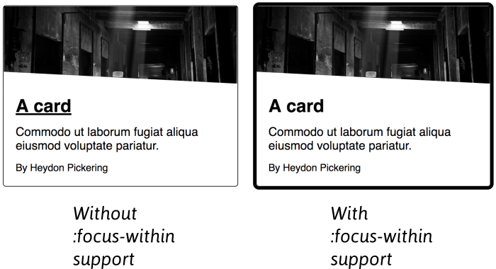
Warning: do not include the :hover style in the same blocks as :focus-within. The whole block will be rejected where :focus-within is not supported, and you'll lose the hover style along with it.
Content tolerance
One unsung aspect of inclusive design is the art of making interfaces tolerant of different levels of content. Wherever an interface 'breaks' when too much or too little content is provided, we are restricting what contributors can say.
Our cards need to be able to accept different length of title and description without the design become ugly or difficult to scan. First, I add some <div> containers for convenience (.img and .text):
<li class="card">
    <div class="img">
        <img src="/path/to/image.png" alt="">
    </div>
    <div class="text">
        <h2>
            <a href="/card-design-woes">Card design woes</a>
        </h2>
        <p>Ten common pitfalls to avoid when designing card components.</p>
        <small>By Heydon Pickering</small>
    </div>
</li>
Then I make both the .card container and the .text wrapper inside it Flexbox contexts, using flex-direction: column.
.card, .card .text {
  display: flex;
  flex-direction: column;
}
Next, I force the textual elements to take up all the available space with flex-grow: 1:
.card .text {
  flex-grow: 1;
}
Finally, to give some balance, I take the last textual element and give it a top margin of auto:
.card .text :last-child {
  margin-top: auto;
}
This pushes the attribution element in the demo to the bottom of the card, regardless of its height.

All that's left to do is add a bottom margin to the second last element, to ensure a minimum level of separation. Using the owl selector to inject a common margin, it all comes together like this:
.card, .card .text {
  display: flex;
  flex-direction: column;
}

.card .text {
  flex-grow: 1;
}

.card .text > * + * {
  margin-top: 0.75rem;
}

.card .text :last-child {
  margin-top: auto;
}

.card .text :nth-last-child(2) {
  margin-bottom: 0.75rem;
}
Note that we are managing margins in an algorithmic way here, using position and context rather than specific element properties. No matter what the elements we place in this text container, the effect will be the same.
Progressive grid enhancement
All that's left to do is place the cards in a CSS Flexbox or CSS grid context wherein the cards will stretch to share the same height: the height of the card with the most content.
Grid and Flexbox can both have this effect, but I prefer Grid's wrapping algorithm and grid-gap is the easiest way to distribute cards without having to use negative margin hacks.
By using @supports I can implement a simple, one-column layout then enhance it with grid where supported:
.card .text {
  max-width: 60ch;
}

.card + .card {
    margin-top: 1.5rem;
}

@supports (display: grid) {
    .cards > ul {
        display: grid;
        grid-template-columns: repeat(auto-fill, minmax(15rem, 1fr));
        grid-gap: 1.5rem;
    }

    .card + .card {
        margin-top: 0;
    }
}
Note the max-width of (approximately) 60 characters on the text container. This prevents the line length for cards on large screens not supporting grid from becoming too long. They won't really look like cards in these conditions, of course, but at least they'll be readable.
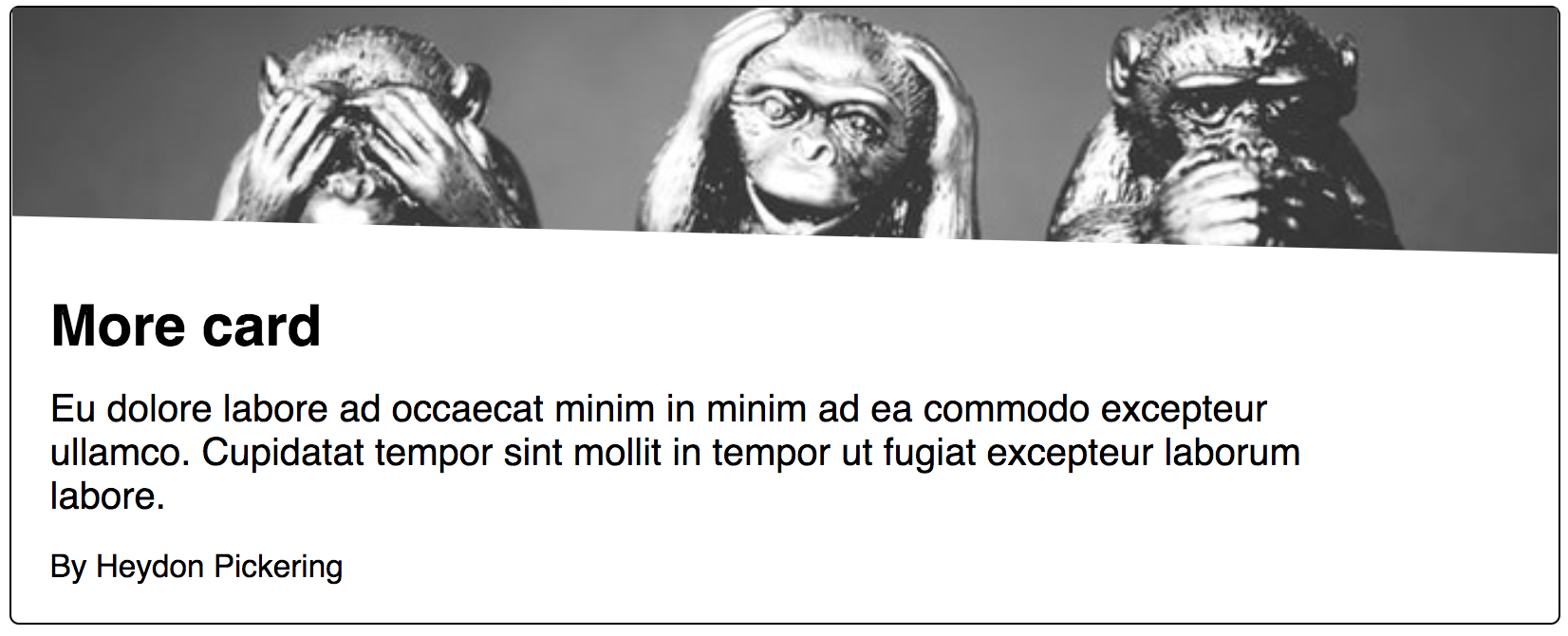
Fortunately, support for Grid is fairly extensive now.
The image dimensions
In addition to allowing flexible text content, we should handle different uploaded image dimensions. The object-fit: cover declaration makes light work of this when combined with a width and height of 100%. This allows us to adjust the height of the image container to our liking without gaps showing or the image becoming squished.
.card .img {
  height: 5rem;
}

.card .img img {
  object-fit: cover;
  height: 100%;
  width: 100%;
}
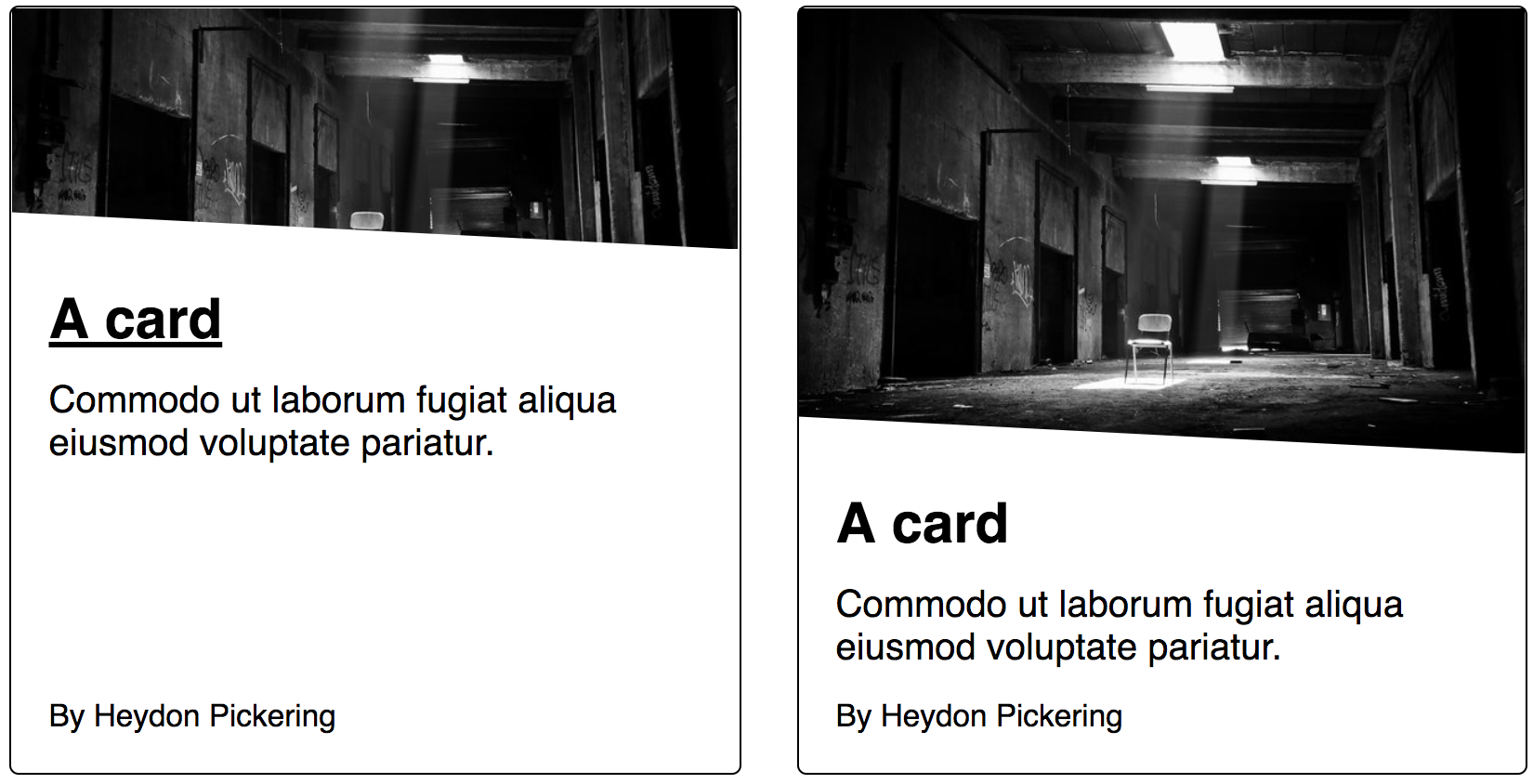
clip-path. This is a progressive enhancement too. No content is obscured where clip-path is not supported.There's an inherent compromise in using object-fit:cover: To maintain the correct aspect ratio, the image will become cropped along two or more edges. Since the image is always centered within its container, it helps to curate images for which the center is the focus. This positioning can be adjusted using object-position.
The author link
What about that author link? The first thing to consider is whether it's necessary or desirable to make this link interactive within the card. Especially if the author's page is linked from the permalink to which the card is pointing. Only add tab stops where beneficial, because too many make navigation by keyboard slow and arduous.
For argument's sake, let's say there is a use case for linking the author within the card. This is viable alongside both the pseudo-content and JavaScript techniques described above. A declaration of position:relative will raise the link about the pseudo-content in the first example. Contrary to popular belief, just the positioning is needed, and no z-index, because the author link is after the primary link in the source.
.card small a {
    position: relative;
}
Author links demo (using pseudo-content)
An issue for some users will be trouble targeting the author link. In most scenarios, a couple of inaccurate clicks or taps are relatively harmless, but where the desired link is placed over another interactive element, the other element might get activated. In this case, that would mean loading the wrong page.
So, why don't we increase the 'hit area' of the author link to mitigate this? We can use padding. The left padding remains unaffected because this would push the link away from the preceding text.
.card small a {
  position: relative;
  padding: 0.5rem 0.5rem 0.5rem 0;
}
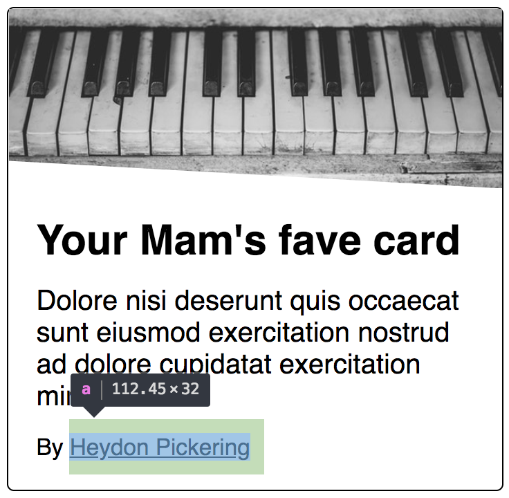
Many people find they have low accuracy when targeting items by touch, including those with Parkinson's disease and rheumatism.
It's also wise to increase the gap between single-column cards on small screens, meaning it's easier to avoid activating a card while scrolling.
@media (max-width: 400px) {
  .cards > ul {
    grid-gap: 4.5rem;
  }
}
Calls to action
As I said already, multiple "read more" links are useless when taken out of context and aggregated into a glossary. Best to avoid that. However, it may prove instructive to have an explicit call-to-action. Without it, users may not be aware cards are interactive. Being obvious is usually the best approach in interface design.
So, how do we supply these buttons but keep the descriptive link text? One possibility is to keep the title/heading as the primary link, and add a decorative 'read more' button separately.
<li>
    <img src="/path/to/image.png" alt="">
    <h2>
        <a href="/card-design-woes">Card design woes</a>
    </h2>
    <p>Ten common pitfalls to avoid when designing card components.</p>
    <span class="cta" aria-hidden="true">read more </span>
    <small>By Heydon Pickering</small>
</li>
Had I made the call-to-action a link too, I'd be creating redundant functionality and an extra tab stop. Instead, the 'button' is just for show, and hidden from assistive technologies using aria-hidden. The trick is to make it appear the button is the interactive element: another job for :focus-within.
I look for focus within the <h2>, and use the general sibling combinator to delegate the focus style to the call-to-action button.
.card h2 a:focus {
    text-decoration: underline;
}

.card h2:focus-within ~ .cta {
    box-shadow: 0 0 0 0.125rem;
}

.card:focus-within h2 a:focus {
    text-decoration: none;
}
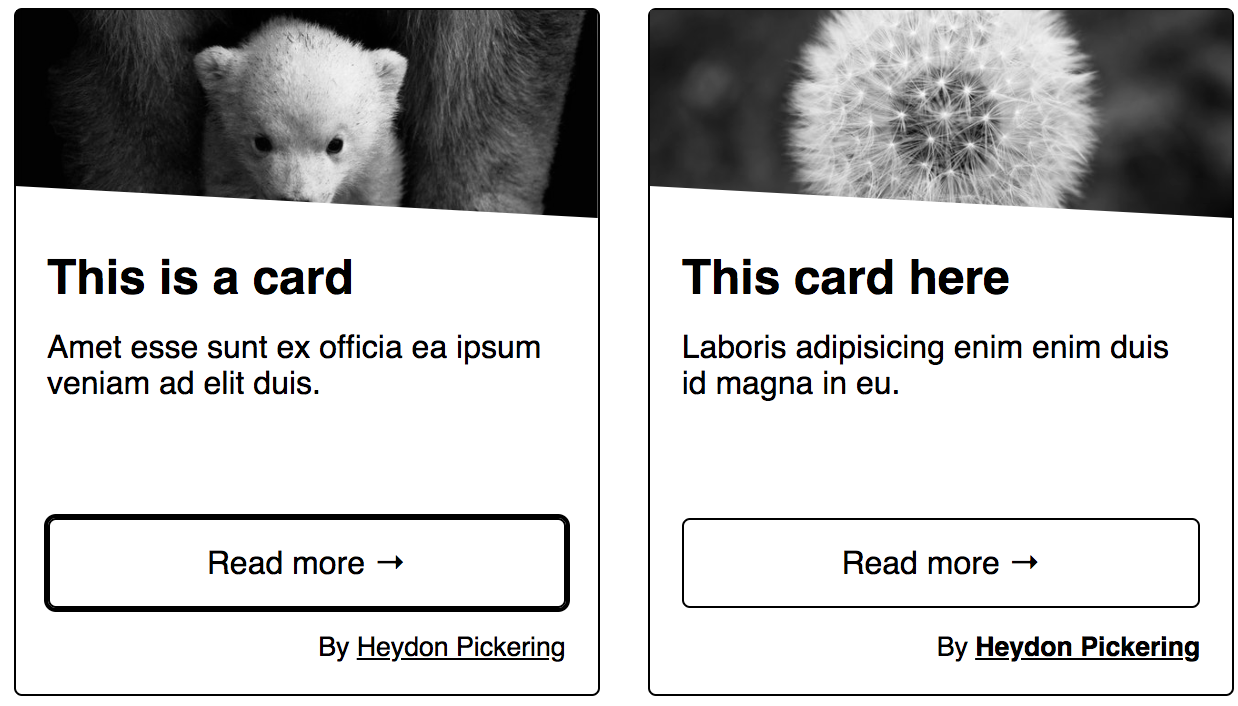
Visual focus order remains logical between the title (call-to-action) and author link:
For sighted screen reader users there's potential for a little confusion here, since "read more" will not be announced despite the element appearing to take focus. Fortunately, we can attach "read more" to the link as a description, using aria-describedby. Now users will hear "Card design woes, link, read more". The description is always read last.
<li>
    <img src="/path/to/image.png" alt="">
    <h2>
        <a href="/card-design-woes" aria-describedby="desc-card-design-woes">Card design woes</a>
    </h2>
    <p>Ten common pitfalls to avoid when designing card components.</p>
    <span class="cta" aria-hidden="true" id="desc-card-design-woes">read more</span>
    <small>By Heydon Pickering</small>
</li>
It works because, even where aria-hidden="true" is applied, the relationship created is still intact and the description available to the link. This is useful where you want to use an element for your description, but don't want assistive technologies to acknowledge the element directly. It would have been confusing to a screen reader user to be be able to browse to the call-to-action and hear the imperative "read more" without the element having a role or being interactive.
Note that, since the call-to-action says "read more" in each case, only one of the calls-to-action elements needs to be referenced by each of the cards' links. Within a templating loop, this is likely to be hard to implement, though.
Unique strings
When creating dynamic content by iterating over data, there are certain things we can't do. One of these is to manually create id values.
For relationships built using ids to work (like the aria-describedby association in the previous example) those id ciphers need to be consistent and unique. There are a couple of ways you can do this.
The first is to create a unique string using some pseudo-randomization. The following snippet, based on a gist by Gordon Brander, is a neat solution:
const uniq = Math.random().toString(36).substr(2, 9);
Using Vue.js, I can apply this unique string like so:
<!-- the id attribute -->
:id="'desc-' + uniq"

<!-- the aria-describedby attribute -->
:aria-describedby="'desc-' + uniq"
One disadvantage of this approach is that testing snapshots will constantly be out of sync, because a new unique string is generated for each build. It's for this reason that I prefer to use a simple 'slugify' function, based on a string already in the page. In this case, the title for the card seems apt.
Here's that function as a small utility module. It would convert "My card component!" to my-card-component:
export default text => {
  return text
    .toString()
    .toLowerCase()
    .replace(/\s+/g, '-')
    .replace(/[^\w\-]+/g, '')
    .replace(/\-\-+/g, '-')
    .replace(/^-+/, '')
    .replace(/-+$/, '');
};
Alternative text
So far, I've been working with the assumption that the card's image is decorative and doesn't need alternative text, hence alt="". If this empty alt was omitted, screen readers would identify the image and read (part of) the src attribute as a fallback, which is not what anyone wants here.
If the image were considered pertinent in terms of content (for example, the appearance of a product that's for sale) we should of course supply a suitable value to alt. But we have a problem, and one anticipated by Andy Kirk who contacted me about it on Patreon.
Currently, the image appears before the text. Since headings, like the <h2> here, introduce sections, having the image before the heading suggests that it does not belong to the section. On one hand, you could argue that the <li> groups the image with the text, but not all users would consume the structure this way. When a screen reader user operating NVDA presses 2 to go to the next <h2>, they would 'skip over' the image and miss it.
The order property
Fortunately, Flexbox's order property allows us to manipulate the source order, then correct for visual appearance.
First I switch the image and text containers around…
<li class="card">
    <div class="text">
        <h2>
            <a href="/card-design-woes">A great product</a>
        </h2>
        <p>Description of the great product</p>
        <small>By Great Products(TM)</small>
    </div>
    <div class="img">
        <img src="/path/to/image.png" alt="Description of the great product's appearance">
    </div>
</li>
…then I just promote the image container to the top of the layout:
.card .text {
  order: 1;
}
Manipulating the order of elements using CSS can cause accessibility issues, especially where it means the focus order contradicts the visual layout. This can be confusing.
In this case, the focus order is not applicable because the image is not focusable. The experience for sighted screen reader users is a little odd but unlikely to cause major comprehension problems since each card is visually self-contained.
Screen readers like VoiceOver provide a visible ring, like a focus style, for each element the user browses — including non-focusable elements. This ring shows the user which element they are on, wherever they are.
Conclusion
Some of the ideas and techniques explored here may not be applicable to your particular card designs; others will. I'm not here to tell you how exactly you should design a 'card' because I don't know your requirements. But I hope I've given you some ideas about how to solve problems you might encounter, and how to enhance the interface in ways that are sensitive to a broad range of users.
Checklist
- Use list markup to group your cards
- Make sure your cards don't break when lines of content wrap or images don't meet specific aspect ratio requirements
- Avoid too much functionality and reduce tab stops. Cards shouldn't be miniature web pages.
- Remember that headings should begin sections. Most everything that belongs to the section should follow the heading in the source.


